
Some Useful Python Methods For Data Analysis
getting-started, maths, code

To get straight to the point, part of my degree includes some data analytics using python; part of trawling the web for learning materials has given me a number of useful methods to use. Unfortunetly these snippits of code never seem to be in the same place, so I'm collating them here:
Before I start heres a list of the python libraries mentioned (all available using pip or included in Anaconda):
- pandas (as pd) - Data representation
- matplotlib.pyplot (as plt) - Plotting and Visuals
- numpy (as np) - Numerics
- seaborn (as sns) - Stats Plotting and Visuals
I used Jupyter Notebooks that are included in an Anaconda distribution, but they can be found on hosted services too (give it a Google). This is a very basic explenation into what can be done and is super generic so I cant class this as a tutorial, more of a cheat page. I found good sources of data on Kaggle (you can do analysis right there on kaggle, its v. cool, but for this example I'm using a csv at the end).
This Section is split up into 6 parts:
- Creating & Collecting Data
- Exploring Data
- Null
- Category
- Numeric
- Cleaning & 'Munging' Data
- Visualisation Of Data
- Creating Models
- Closing Notes
Pt 1 - Creating & Collecting Data
Mostly using the Pandas Dataframe object, mostly from a csv:
1df = pd.DataFrame.from_csv(file, index_col=None)
or with columns:
1 2cols = ["col1","col2",..] df = pd.DataFrame.from_csv(file, index_col=cols)
Depending on the Type of csv I'm reading. If it contains column titles then Pandas usually picks up on it quickly. If you've got a Dataframe and need to get its columns use a list: cols = list(df)
Once you have 1 or more DataFrames (possibly in a list) you're able to merge them in different ways:
- Put another df(s) on the bottom if they have the same attributes:
df=pd.concat([df1,df2,...],ignore_index=True) - Just appening with
df.append(df)(a more relaxed version of the above) - Put them on the side (if they have a common column):
df3 = df1.merge(df2,how='left') - Add another column:
df["new_col"]=data - Dropping columns (or rows with axis=0):
df.drop(axis=1,labels=["col"])
Dynamically adding data to a DataFrame can be done like this:
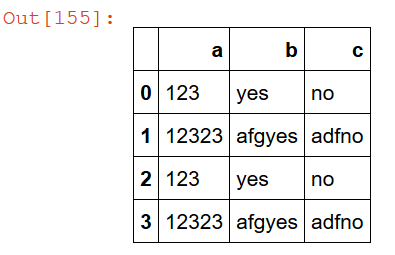
1 2 3 4 5 6 7df = pd.DataFrame(columns=["a","b","c"]) x = {'a':123,'b':"yes","c":"no"} df = df.append(x,ignore_index=True) y = {'a':12323,'b':"afgyes","c":"adfno"} df = df.append(y,ignore_index=True) df = df.append([x,y],ignore_index=True)
This will add the rows x then y then both x & y:
Pt 2 - Exploring Data
In order to clean data we have to have a looksee and find missing data, data that seems incorrect and such. There are techniques to finding these errors/mishaps easily:
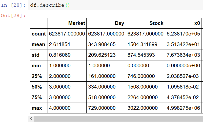
1 2 3df.info() df.describe() df.head()
This is the first thing I do, it lets me see what my data kinda looks like & some summary of the info. If theres anything horribly wrong you can probably find it here (like it having/ not having column names or what not)
Null Data
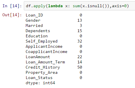
Looking up Null data, be it NaN, None, Null... it should come up using this.
1df.apply(lambda x: sum(x.isnull()),axis=0)
This will count up the number of null values in each column, a bit like so:
Categorical Data
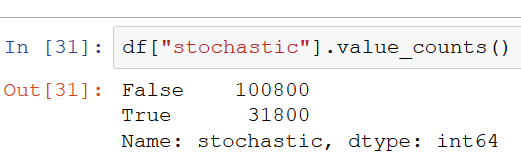
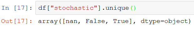
Counting values for categories (it works with numerics but its not a great idea).
1df["col"].value_counts()
This will give you the number of categories there are in each column(it wont tell you how many nas there are though):
Numeric Data
Before looking into distributions and stuff its nice to follow the following steps:
- Are there any missing/inf/NaN/None/Null Data?
- fix that stuff (see pt3)
- Are there any crazy outliers?
- decide what you want to do about them (This has some nice theory for what to do if theres a problem)
- Start looking into the data
Summarizing data is easily done with the describe method; this will produce an unsaved table that covers some of the useful numbers needed to spot issues/trends.
1df.descibe()
Otherwise, after fixing the problems in steps 1 & 3 above, you can look into the pt 4 for pretty ways of plotting the data.
Binning data is also another useful technique, splitting up your range into equal size bins ad giving them labels means you can look into sections of observations very easily (by using the df.groupby() method for example).
1 2label_names = ["very low","low", "medium", "high", "very high"] df["new_bin_col"]=pd.cut(df["col"],5 , labels=label_names)
This will create a new column that contains the bin labels depending on the scores given in column "col"; whatever an observations score is, it will be mapped to a label and this label will be given in this new column.
Pt 3 - Cleaning & 'Munging' Data
Munging - to modify,in an easily reversible way, some data. ie, make changes to create more informative analysis, in our case.
Filling in Data
After identifying missing data we have to do something with it; sometimes refilling these missing points with an average (numerics) or a new category (categorical) is an easy enough fix without affecting the true result too much: (depends on what you're looking at)
1 2df['numeric_col'].fillna(df['numeric_col'].mean(), inplace=True) df['category_col'].fillna("new_category", inplace=True)
This should be done after identifying what type of data you've got, what result you're looking for and what the possible implications this could have. In some cases its easier and more effective to just remove it.
Dropping Data
Dropping rows(axis=0) or columns (axis=1) if they have 'all' or 'any' NAs, or even only if they have more NAs than a given thresh hold.
1 2df.dropna(axis=0,how='any') df.dropna(axis=1,thresh=2)
The docs page is probably a good read so you don't drop all your data by accident.
Mapping Data
If youre wanting to create a catagory of data you can use a map to a dictionary, the example below code means we remap Males to 1 and Females to 0.
1df['Sex'] = df['Sex'].map( {'female': 0, 'male': 1} ).astype(int)
Pt 4 - Visualisation Of Data
Before you start looking through the numerical data plotting you have it might be more useful to look into Pt 3 to fix any imperfections. Plots will fail or look funny if the data has some crazy outliers or missing values.
Looking into the distribution/correlation of your data sets? Seaborn has pairplot which is incredibly useful for looking into these properties:
1 2plot = sns.pairplot(df) plot.savefig("save/path.pdf")
note: This will eat up your memory for a few mins...
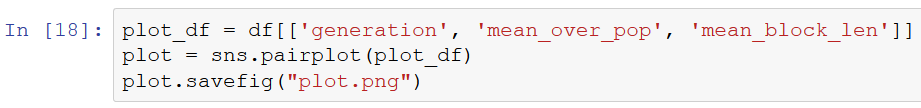
(Theres not really any relationship in this data, but you get the point of what it does; the middle ones are histograms and the others are scatter plots)
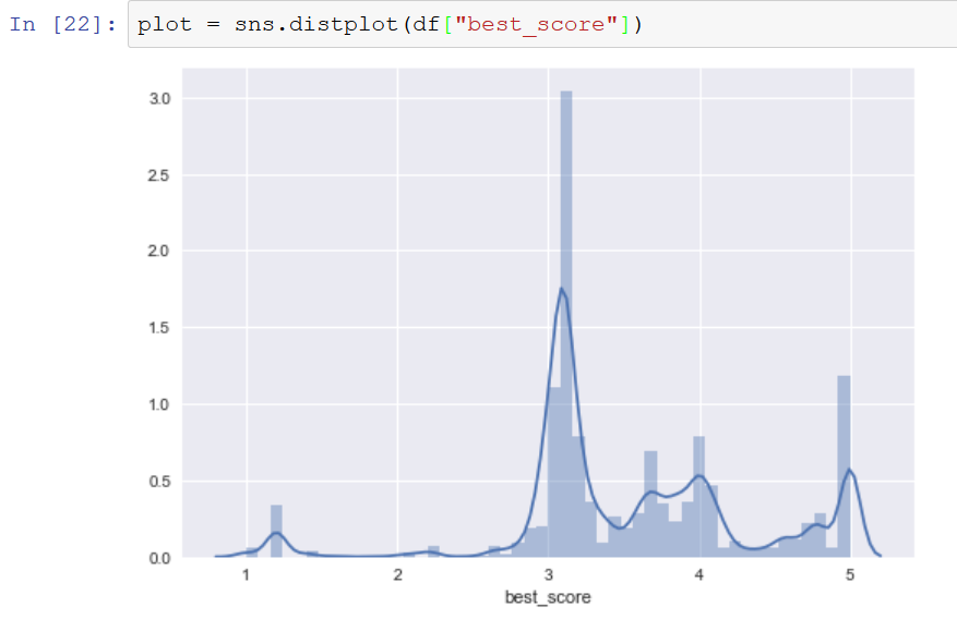
If you're interested in just one or two columns, then Seaborn has some nice histograms and correlation visualisation tools:
Histograms
1sns.distplot(df["col"])
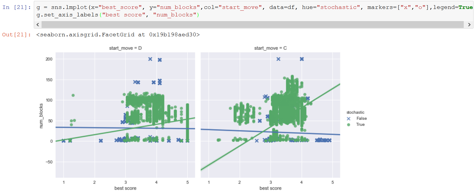
Multi Linear Regression
1sns.lmplot(x="col1", y="col2", data=df)
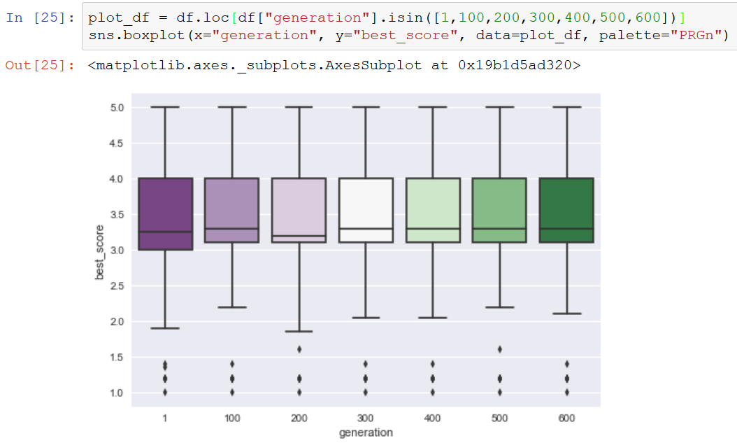
Boxplots
1sns.boxplot(x="col", y="col", data=df)
These are just a few of the offerings by Seaborn with lots of others that can be used depending on the type of data. For example the jointplot() gives lots of information about the relationship between 2 variables.
Pt 5 - Creating Models
This part is probably the hardest...
Torture the data, and it will confess to anything. ~ Ronald Coase, Economics, Nobel Prize Laureate
If you apply a model to data where the model doesn't make sense you can come away with some very strange answers. Scikit Learn is the main ML library that is used to build models in python, and it has a very useful cheat sheet:
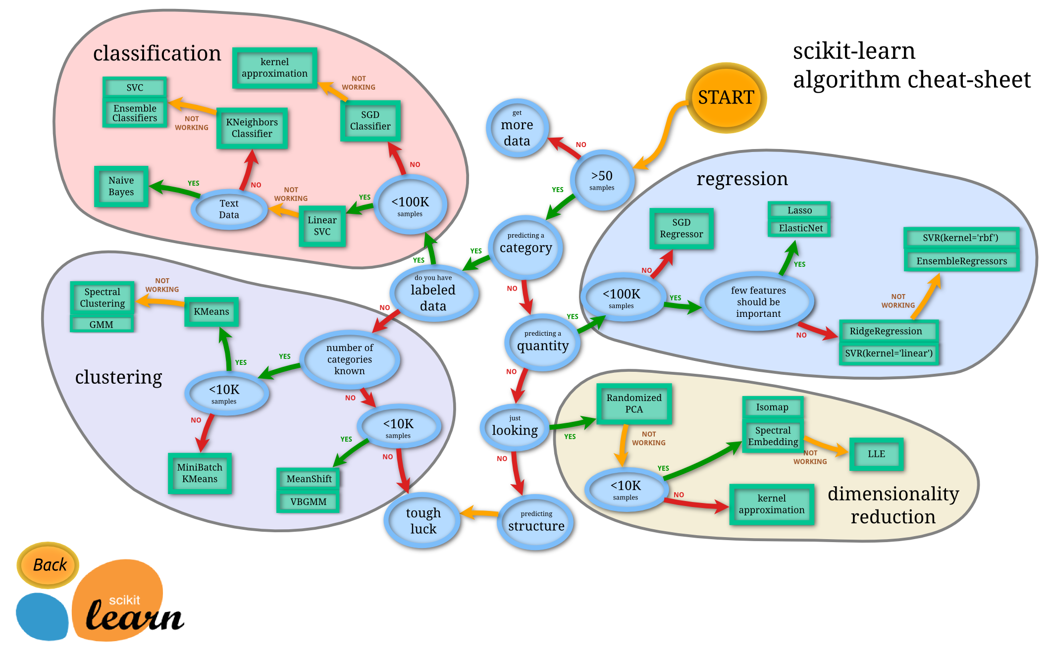
Their documentation is probably the best learning material on how the code is written; but if you want to know why models work it might be more useful to do a deep dive course to understand the maths behind them.
Pt 6 - Closing Notes
This blog post is long and probably not structured as well as I think it is, so apologies for that. If it does help then I hope your data science work continues to flourish. Further reading would just be some useful things that have come up in my work which, once explained properly to me, explained why I wasn't seeing results other people did and why my predictions where usually quite far off.
Further Reading:
- p values - for significance tests (the usage section is a brief overview)
- Simpson Paradox - Sneaky hidden data correlations
- Confounding - More Sneaky data issues
- Misuse examples - for what not to do when conducting analysis